Accessibility and inclusivity: how to adapt visual content for all users
Whiteboard
Team
2 min read
May 11, 2025
Inclusive design is not just a trend but a prerequisite for digital interaction. When visual content is not adapted for people with disabilities, it excludes millions of users from educational, professional and public life. Adapting interfaces and visual collaboration boards to accessibility standards expands the audience and makes a product more universal.
Core principles of accessible design
Creating an inclusive environment starts with a deliberate approach to design. Visual content should be:
Legible: clear contrast between text and background.
Flexible: scalable without losing structure.
Predictable: logical navigation and sequence.
Alternative: graphics duplicated with text, descriptions provided.
The main goal is to provide equal access to information regardless of how people perceive it.
Color and contrast: accounting for color blindness and low vision
One of the most common barriers is the misuse of color. Up to 8% of men and 0.5% of women have some form of color blindness. To make visual content accessible:
Use not only color but also shapes, textures and icons to indicate states.
Check contrast: WCAG recommends at least 4.5:1 for regular text and 3:1 for large text.
Avoid combining red with green and blue with purple.
Use checking tools such as Color Oracle or Coblis.
By making sure elements are distinguishable, you make the interface convenient for everyone.
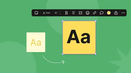
Fonts and scaling: readability for everyone
A poorly chosen font makes even high-quality content inaccessible. Recommendations:
Use sans-serif fonts — they are easier to read on screens.
The minimum text size is 16 px, with the ability to enlarge it without losing structure.
Avoid long paragraphs and all-caps text.
Use sufficient line and letter spacing.
This is especially important for people with dyslexia and low vision.
Navigation and interaction: logic and predictability
Users with cognitive impairments or motor limitations may have difficulty moving through a complex board or page structure. Solutions:
A logical order of elements: from the top left corner to the bottom right.
Keyboard navigation.
Highlighting of active elements.
Minimizing the number of actions needed to get a result.
This approach makes the interface friendly and reduces frustration for all categories of users.
Text alternatives and descriptions
Every visual element should come with a text equivalent. This is a key accessibility principle:
Alternative text for images (alt tags).
Captions for charts and diagrams.
Text duplicates of instructions that are indicated only by color or an icon.
The ability to use screen readers.
These practices allow people with visual impairments to get the same information as other users.
Inclusive design is an investment, not a cost. It:
Inclusive design is an investment, not a cost. It:
Expands your audience: educational institutions, government agencies and nonprofits are required to use accessible products.
Increases satisfaction for all users — logical, simple interfaces benefit everyone.
Strengthens your reputation: caring for users with disabilities is ethical and modern.
Reduces legal risks — in many countries, an inaccessible interface violates the law.
Adopting accessibility principles is a step toward universal design, with no exclusions or limitations.
Modern visual tools, including online whiteboards, should evolve toward full accessibility. This is not just a technical task but a duty to create an environment where everyone can participate, learn and work. Simple but well-thought-out steps make the digital world understandable, equal and humane.
Authors

flip
Team