

A component gathers several flip objects — shapes, text, images, emoji and arrows — into one block that you can insert as instances on any flip of the space. The objects you create a component from become the main component. When an editor changes the main component, the changes reach all its instances. All components of the space are collected in the “Components” panel: there you can find them, insert an instance and view the change history
Requirements
- Components are part of the paid plans. On the Mini plan, trying to create a component or open the “Components” panel opens the “Components” window that offers to switch to another plan. Learn more in the plan comparison
- Anyone who can edit the flip can create components and insert instances
- The “Components” panel and the Open component and Discussion buttons are available to space members who are logged in to their account
How to create a component
Select the objects on the flip that the component will consist of: shapes, text, images, emoji. Arrows become part of the component if both of their ends are attached to the selected objects
Click Create component — the first button in the selection menu. If one object is selected, right-click it and select Create component. You can also press Ctrl + Shift + K (⌘ + Shift + K on macOS)
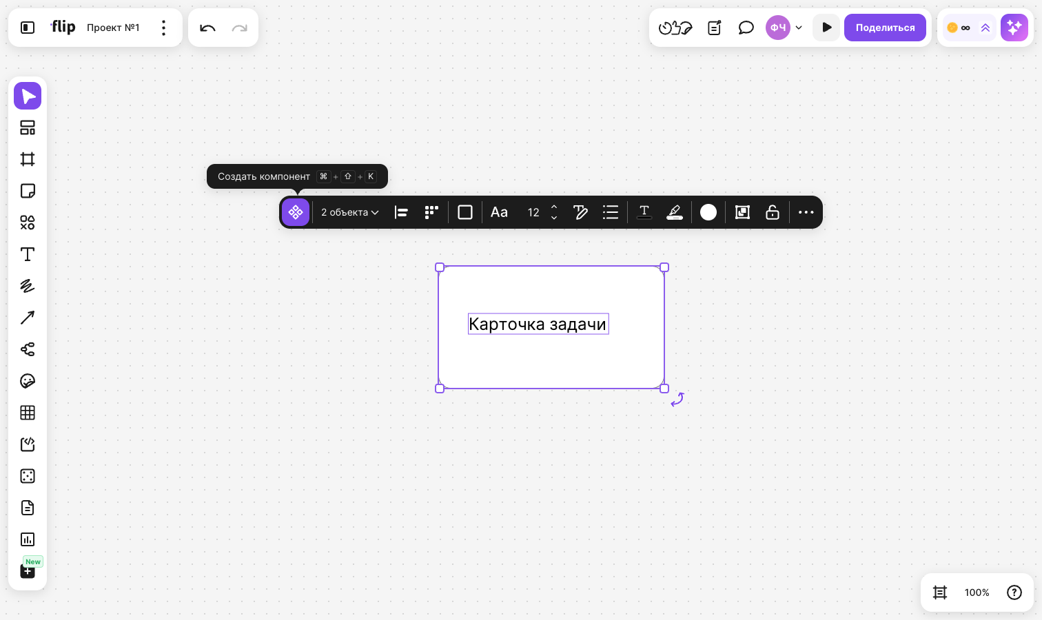
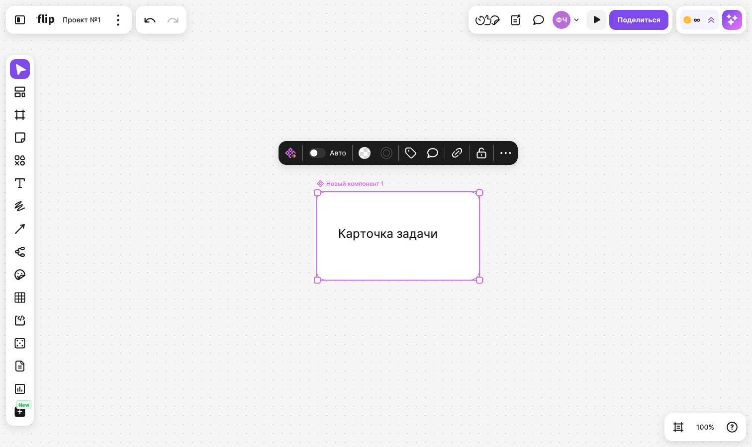
The objects become layers of the main component, and the component itself is named “New component 1”, “New component 2” and so on. The name is shown above the main component
If the selection contains an object that can't become a layer, the Create component button doesn't appear. Learn more in the Limitations section
How to rename a component and sort it into folders
Double-click the name above the main component, enter a new one and press Enter
To put a component into a folder, specify a path with “/” in its name, for example “Cards / Product”. The “Cards” folder with the “Product” component inside appears in the “Components” panel. While you type the path, flip suggests existing folders — pick one with the arrow keys and press Enter, or click it
How to change the main component
Select the main component — a panel appears above it:
- Open component — open the component card in the “Components” panel
- Auto — turn automatic layer arrangement on or off
- Fill and Border — the background and the outline of the component
- Tags — assign a tag to the component. The tag is shown next to the name above the main component, and you can filter the list in the “Components” panel by it
- Discussion — open the component discussion
- Hidden variables — the list of hidden variables, learn more in the Variables section
To change the layers, double-click the main component — you enter it as you would a group. Inside, layers are selected, moved and edited one by one. A new object that you create or drag inside an open main component becomes its layer. To exit, click an empty spot on the flip
Changes to the main component reach all its instances
Important
Only its editors can change the main component. Others who try to enter the component see the notification “Only its editors can change the main component”. The main component can only be changed on the flip where it is located
How to set up automatic layer arrangement
Select the main component
Turn on the Auto toggle in the panel above the component
flip detects how the layers are arranged and keeps this arrangement and the spacing between them when layers change, are added or removed
To keep a single layer out of the automatic arrangement, double-click the component, select the layer and turn on the Position toggle in the panel above it, or press Ctrl + Alt + A (⌘ + ⌥ + A on macOS)
To turn off automatic arrangement, click Auto again
How to work with variables
A variable is a layer of the main component that you've given a name. Variables are collected on the “Variables” screen of the component card, and you can hide and show them in all instances at once
Double-click the main component and select a layer
Click Variable in the panel above the layer
In the “Name” field, keep the suggested name or enter your own. Text and shapes also have a “Value” field — you can change the layer text right in it
Click Create. To change the variable later, open Variable again and click Update
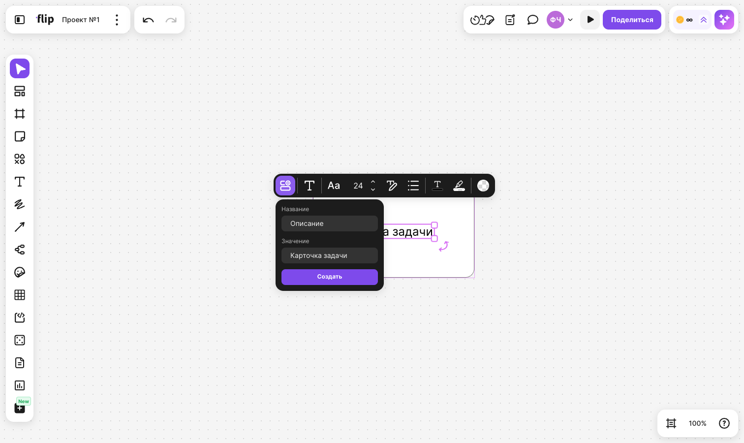
To manage variables, open the component card and select Variables:
- The toggle next to a variable hides or shows its layer in the main component and in all instances. At least one variable must stay visible
- The variable menu contains Rename and Delete variable. When you delete a variable, the layer stays in the component
You can also bring back a hidden variable without the panel: select the main component, click Hidden variables and select it in the list
How to insert a component instance
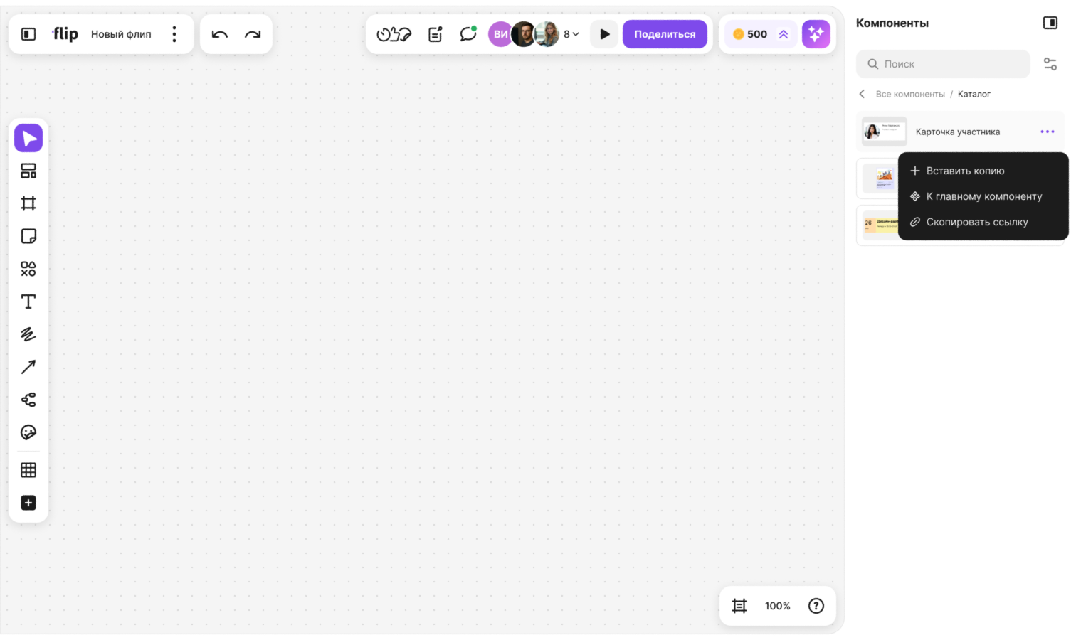
Click Components in the bottom right corner of the flip — a panel with all components of the space opens on the right
Find the component you need: open a folder or enter its name in the “Search” field
Hover over the component, click the menu button and select Insert instance. You can also open the component card and click Insert instance there
The instance appears in the center of the screen
An instance also appears if you copy or duplicate the main component. You can insert an instance on any flip of the space — it stays linked to the main component
How to change an instance
Select an instance — a panel appears above it:
- Open component — open the component card in the “Components” panel
- Detach instance — turn the instance into regular objects, shortcut Ctrl + Alt + B (⌘ + ⌥ + B on macOS). The objects stay in place but no longer update after the main component. Layers of hidden variables are deleted
- Reset changes — give the instance back the look of the main component. The button appears if the instance has been changed
- Fill and Border — the background and the outline of the instance
- Discussion — open the component discussion
The same actions are in the context menu of the instance — right-click it
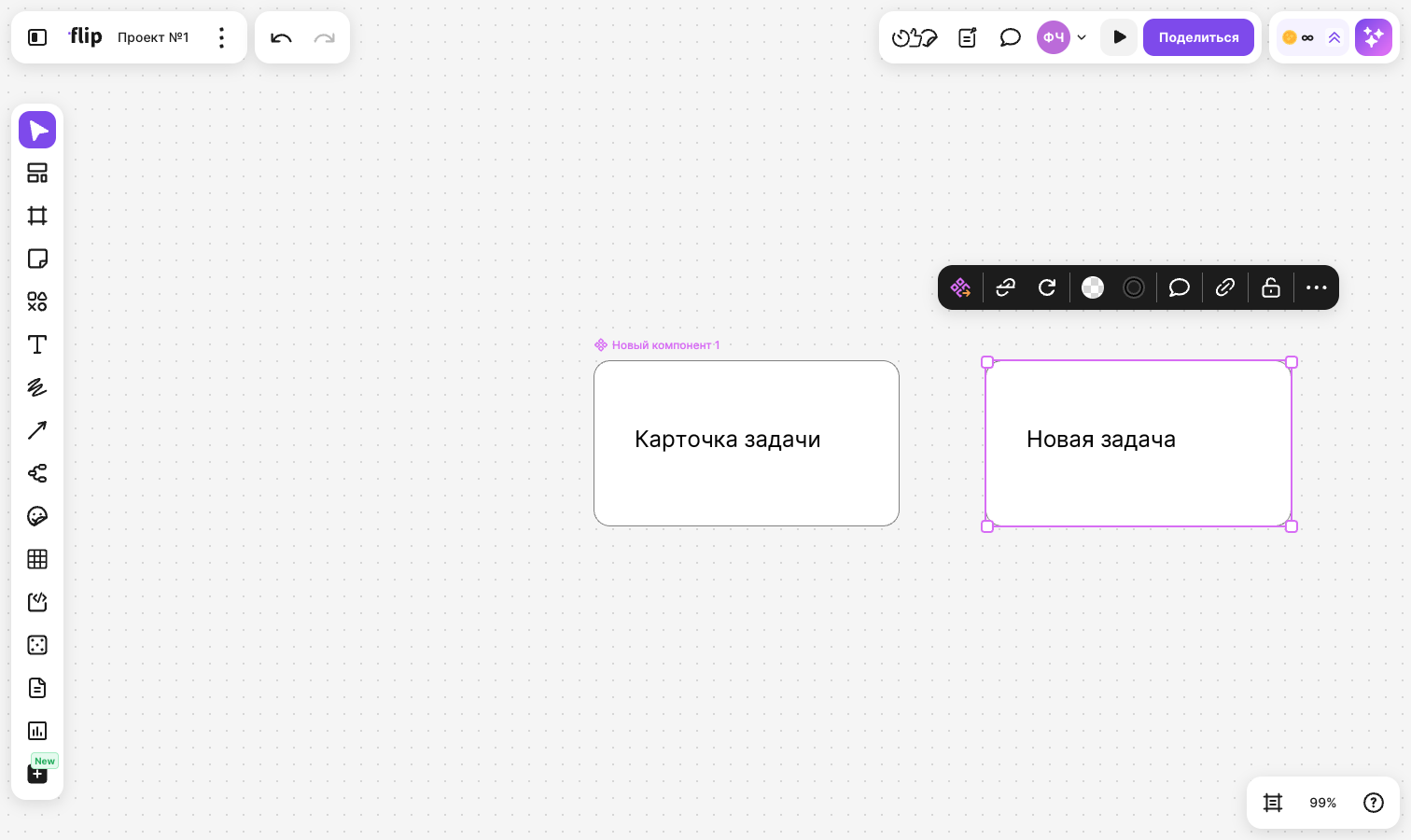
To change the layers of an instance, double-click it and edit the layer you need. You can't delete a single layer of an instance — flip shows the notification “An instance layer can't be deleted or moved”
Component editors can lock instances. Then trying to enter an instance shows the notification “The creator of the main component doesn't allow editing instances”, and the Reset changes, Fill and Border buttons don't appear in the instance panel. You can still detach the instance in this case
How to use the “Components” panel
Click Components in the bottom right corner of the flip. The panel shows components whose main components are located on flips of the space available to you: folders first, then components in alphabetical order
- Enter text in the “Search” field — flip finds components by name and by their folder path
- The button to the right of the search switches between List view and Grid view. The Tag item in the same menu keeps only components with the selected tags or No tag in the list. If nothing matches the filter, click Reset filters
- The component menu contains Insert instance, Go to main component — go to the main component even if it is on another flip — and Copy link
Click a component to open its card. It shows the preview and the name of the component, the Insert instance and Go to main buttons, and also:
- “Board” — the flip where the main component is located. Click its title to open it
- “Creator” — who created the component
- “Editors” — the number of editors. Click it to open the list
- “Created” — the creation date
- “Instances” — whether instances can be changed: “Editable” or “Locked”
- Variables, History and Discussion — separate screens of the component
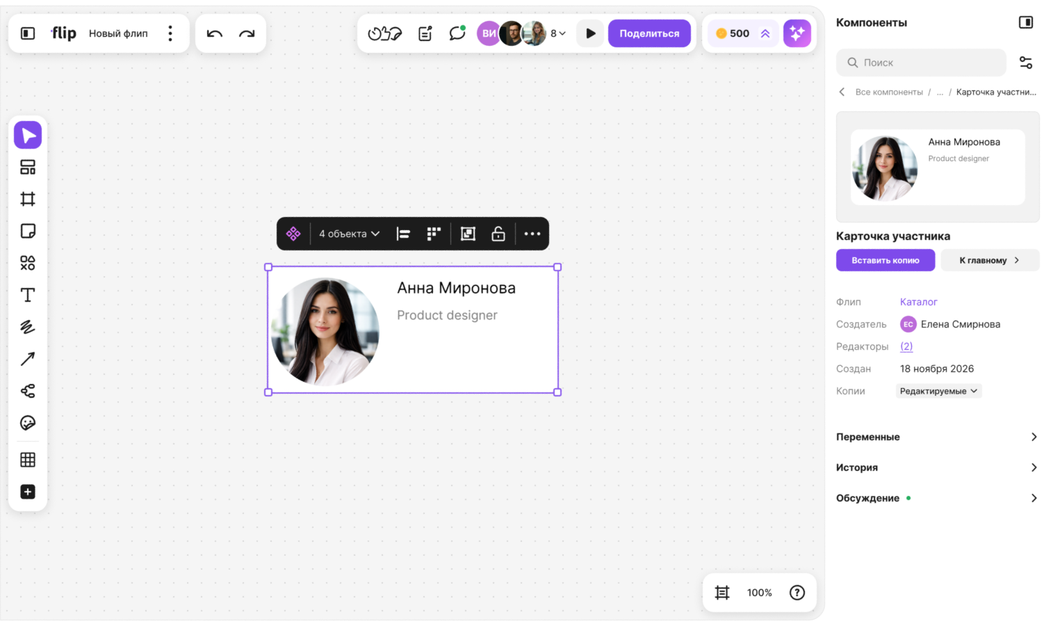
To lock instances, click the value next to “Instances” in the card, select “Locked” and confirm with Lock. Changes already made in instances are kept. Component editors can change this setting
The History screen collects changes to the component by day: who changed what — the name, tags, layers, variables, appearance, editors. On the Discussion screen, space members talk about the component: write a message in the “Write a comment” field. You can edit and delete your own messages and add reactions to messages. If the discussion has unread messages, a mark appears next to “Discussion”
How to assign component editors
Editors can change the main component, its name, tags, variables and the instances setting. The default editors are the space owner and admins, the component creator, the flip creator and the team owner — they have a role badge in the list
- Open the component card and click the number next to “Editors”
- Click Add editors
- Find members by name or email, check the ones you need and click Add
To remove an editor, hover over their row and click Remove from editors. Members with a default role can't be removed
What happens if you delete the main component
The main component is deleted like a regular object. If you delete all of its layers, the component is deleted too. Instances stay on the flips, but the label “Main component deleted” appears above them, and the component disappears from the list in the “Components” panel
To bring back the main component, select any of its instances and click Restore main component in the panel above it, or select Restore main component in the context menu. The main component appears on this flip to the right of the instance
Limitations
- Shapes, text, images, emoji and arrows can be component layers. Stickers, frames, tables, mind map elements and locked objects can't be part of a component
- You can't create a component from arrows only — at least one other object is needed
- You can set up to 5 subgroups with “/” in a component name
- The name is shown only above the main component and above instances whose main component is deleted. When you zoom out a lot, names are hidden
- The Components button in the bottom right corner and the Open component button are available on a computer and a tablet
- The “Component” type is available in the type filter and flip search